A Few Notes on Graphing
by S.E. Van Bramer 2/4/97
First point is that a graph is a way to communicate. There is not a "right" and a "wrong" way to
do it. Your goal is to effectively communicate information to your reader. However, there are
some general guidelines that will help.
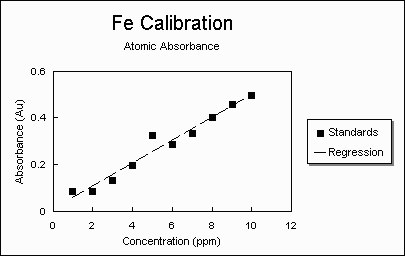
- Use Descriptive Titles. Give your graph a name that tells the reader what your graph is
about. DON'T just repeat the axis. They should already be labeled so this does not give
the reader any additional information.
- Number the graph. All figures should be numbered sequentially and placed at the end of
your report.
- Label the axis and include the units. The axis should be clearly labeled so that the reader
knows how you are presenting the information. It is also important to include units, they
are just as important on a graph as any other time.
- Data should be points. Your data will usually include a set of several points. Display
them as such by using symbols. Avoid using the "connect the dots" form that
spreadsheets like to use. Lines show trends and relationships. Just show your data. An
exception to this is if you have a very large number of data points (like more than 20) so
that plotting all the points becomes distracting. If you have enough data to show a
continuous set of points, one right next to another, then it is appropriate to graph your
data as a line.
- Equations should be lines. If you include a mathematical equation, it should be a line.
For example: the straight line calculated from a linear regression should be graphed as a
line (since it is a continuous function). The equation is not a set of data points, so don't
use symbols.
- Turn off any shading or grids. These usually are just distracting to the reader. The grids
and shading waste toner (Ink for the printer) and they make the data more difficult to see.
- Make it BIG. A tiny graph is difficult to read. Print it out on a whole sheet of paper (or
maybe two graphs on a page max).
- Label the points (using the legend). If you graph two different "things" make certain the
reader can tell which is which. If you graph your experimental data using little triangles
and an equation that fit's your data using a blue line, make certain that you have a caption
that indicates which is which. If you use colors, be careful since they may be impossible
to distinguish when you print in black and white. To distinguish different sets of data
points, use different symbols (triangles, x's, squares, circles, etc). To distinguish
different lines, use different line types (solid, dash, dot-dash, etc.) if you will be printing.
If you will be using color, then distinguish different lines as different colors.